The Stylus is mightier than the sword
In an image-saturated advertising world, it can seem like an impossible task to defend your brand from invisibility. When it comes to finding a direction for your brand, re-brand, or campaign, it’s easy to feel overwhelmed.
Your instinct may be to go for rich imagery, right? Anyone can access an image library and search for a photograph that may match your product or service, but that’s hardly a bespoke approach. And the likelihood of another brand using that very same stock image? Pretty high.
Illustration opens up a world of branding possibility. With the creation of characters, patterns, and scenarios comes ultimate control and ultimate originality.
Enunciate, elucidate, illustrate
Illustration allows your brand to enunciate with clarity of messaging, simplified processes, and sign-posted user journeys.
Plus, illustration doesn’t need to pretend to be ‘real’. By its nature, illustration can be bold, brash, and distorted. Whereas if you tried to create a similar effect with photography, you’d be in danger of baffling and alienating your customers.
A combination of illustrated imagery and motion engages customers, and entices them to linger on your website, digging deeper into what you have to offer. Micro-animations within illustration on a website, in advertising, or in-app design can improve user interaction.
As more brands look to use motion graphics and animation within their website and social media channels, now is the time for them to clarify their voice and direction. Illustration gives digital brands a way of creating a tangible product consumers can relate to.
And finally, illustration can perfect that fine line between empathy and sympathy. Imagery can be emotive, however, it can also bar the user from personally aligning with the brand. That other person is in the way of their empathy. Illustration, however, gives you all the personality of people and of brilliant branding. By removing those ‘real’ people, you allow your users to place themselves within your world. They can empathise.
The battlefield
Ok, illustration might not hit the mark for all campaigns. And there are many other, brilliant formats to say what needs to be said. But here are a few examples of businesses that have chosen an illustrative path and have cracked it. They hit that sweet spot between information delivery, story-telling and consumer awareness.
Oscar Health
Health insurance branding can often favour a clinical approach, with complicated jargon. Oscar Health took one giant leap away from that. Wanting to focus on the individual as a consumer, rather than the corporate who may be doing the offering. This straightforward and friendly approach has created a casual tone of voice combined with minimal, stylish cartoons resulting in a simple, intuitive, and human brand.

Toggl
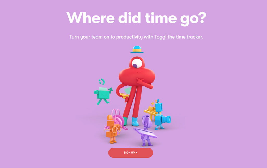
Toggl is the leading time tracking app for agency teams and small businesses. How could such a company successfully choose imagery to encompass all that the software can do? This is where bespoke illustration has served them well. Bright, eye-catching, quirky and humorous, the style Toggl settled upon serves them well to illustrate the product capabilities.
Kuoni
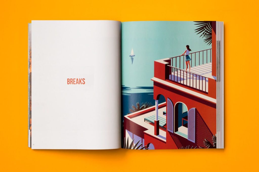
When it comes to glossy brochures of beautiful holiday destinations, there’s little room for imagination. Many holiday companies sell the same destinations, and you’ll see the same stock imagery published year after year. So when luxury travel brand, Kuoni, took a segue into stunning illustration for it’s 2015 brochure, created by Malika Favre, the travel industry – and its customers – sat up and took notice. So much so, we’re still reminiscing today.
Headspace
Offering guided meditation online, Headspace have committed to using illustration in every aspect of their marketing. Whimsical and relaxed in style, the illustrators have created a calming environment in which to explain their products and services. From an illustrated ecommerce website, to animated videos on how it all works, they are set to improve ‘the happiness of the world’ one illustration at a time.

We’re not all talk
And just to show we’re not all bark and no bite, here’s some of our own illustrative work for our brilliant clients.
Cyber adAPT
A relatively new player in the crowded global cyber-security market, the Cyber adAPT team developed the iiluminate programme – a free, proof-of-concept trial for prospective customers. The team commissioned ifour to develop a campaign to communicate the concept and promote the free trials.
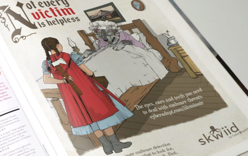
Swimming against the tide of ultra-techy concepts, we told the story of what the iiluminate programme would do for clients by telling classic fables and fairytales, with a twist. Our bespoke illustration empowered the hero of the story, the client, and equip them with what they needed to turn the tables on evil adversaries – a perfect metaphor for the Cyber AdAPT offering.
Fourex
Fourex is money exchange made easy. Mixed coins and notes are placed into the kiosk, and the machine identifies, evaluates and exchanges the sum. The kiosks accept coins and notes from over 150 currencies, and converts into pounds, euros, and dollars.
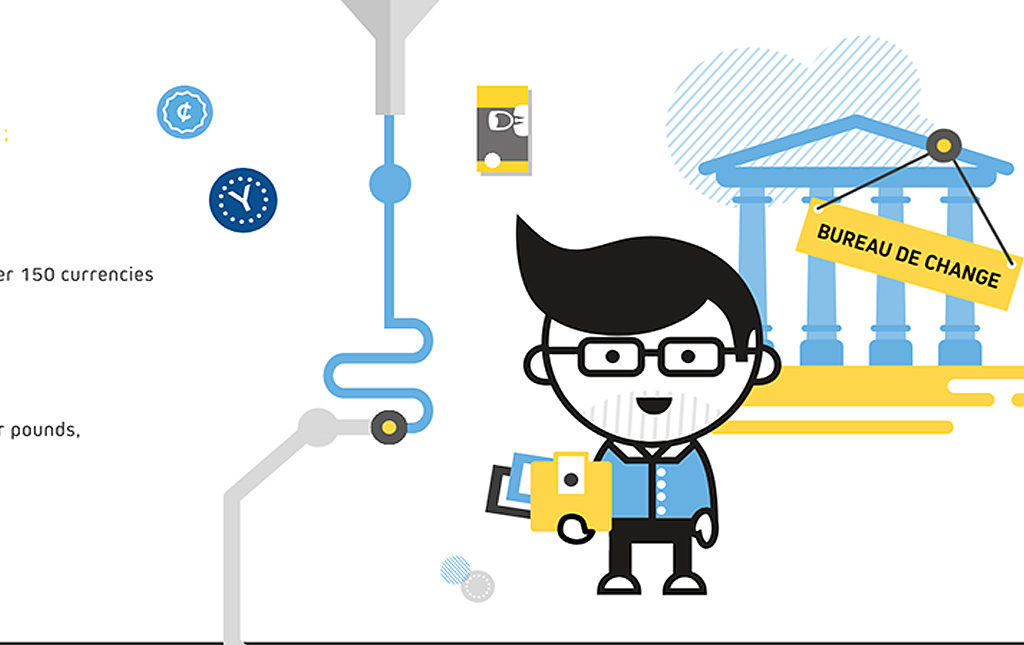
We have been involved in this brand since its inception. Our bespoke character design enabled Fourex to have a voice through ‘Freddie.’ Freddie talks customers through the process, using animations and easy-to-digest copy. We’re currently in the process of making Freddie 3D to enable the client to use him across other platforms!
Knauf
Knauf is a leading multinational producer and supplier of building materials and construction systems. Knauf commissioned us to create and drive an engaging multi-channel campaign to raise awareness of its range of products to a broad audience of influencers, buyers and decision-makers.
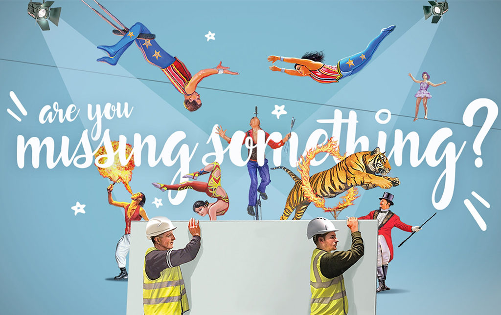
We revealed two key insights, which were used as the springboard, conjuring an illustrated world where unsuspecting Knauf customers were confronted with breath-taking spectaculars and unmissable extravaganzas. All they needed to do to be part of the jamboree was (literally) look past the plasterboard.
We’ve also notched up a dazzling stream of videos, quizzes, and websites for our clients, whether they’re fully animated, or use micro-animations to explain processes, deliver stats and engage the visitor.
Frankly, there’s nothing we love more than adding creativity to messaging that would otherwise remain static and unengaging.
Our wielders of the baton
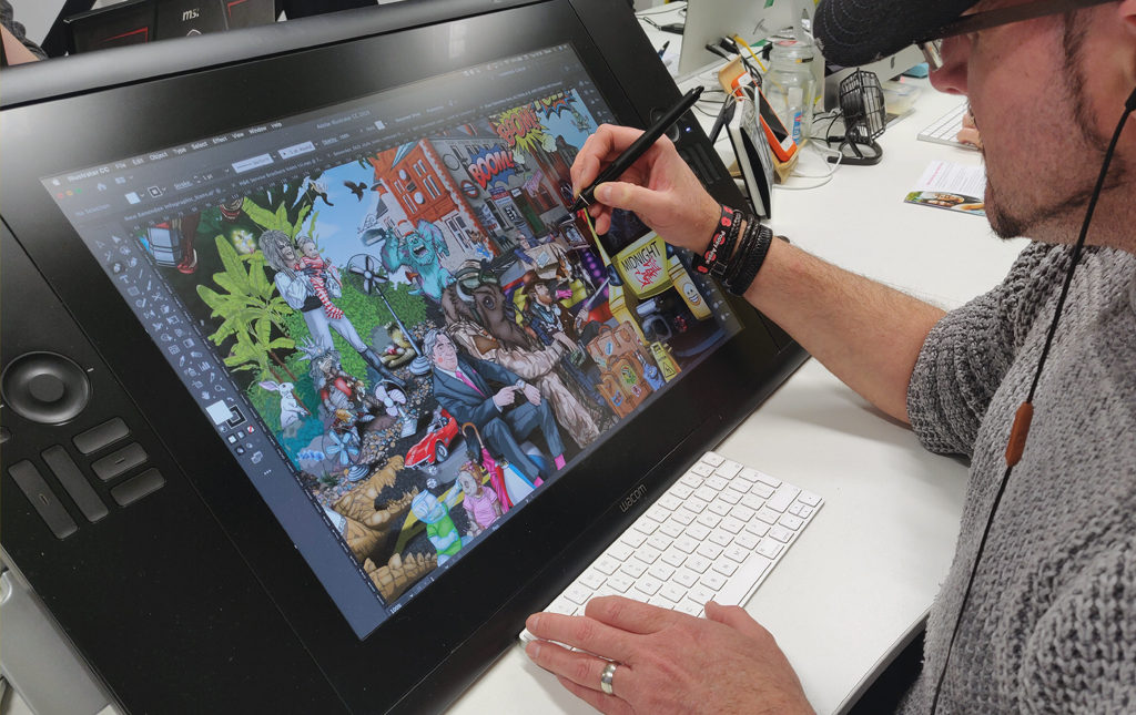
As well as our brilliant band of senior designers, all masterful in the full Adobe suite, we are excited to announce the skills of Steve, illustrator extraordinaire, and young James, a graduate 3D designer and animator.
Steve’s drawing prowess on his Wacom Cintiq 22HD is a sight to behold, and James has the ability to transform everything and anything to 3D. Their skill set combines Photoshop, Illustrator, ZBrush, Maya, Substance Painter, Unity, and Marmoset Toolbag, and we can’t wait to let them loose on your projects.
Emerging trends
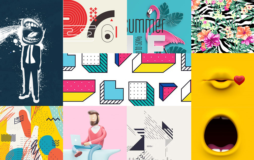
The style and route of illustration you want to take may be decided upon after much discussion with your team but it’s worth noting that, just like photography and branding, illustration styles also peak and trend. Here are a few themes that are likely to be on the radar in 2019
- Bright colours and simple shapes
- Mixed patterns and prints
- Organic and handmade
- Playful and fun – 3D
- 1980s/1990s
- Isometric and asymmetry
- Quirky and abstract
So, if you have an upcoming branding project or campaign, don’t be afraid to consider illustration as an option and see it’s potential. Do get in touch with us to let’s delve into what you want to say and how you could say it.

