Vistra
Making the customer the hero
Complex services worth noticing
Vistra is a global platform that helps corporates and funds manage governance, tax, compliance and administration as they operate across borders. It brings command and control to complex international structures through a single view, supported by in-country expertise that understands local regulations, deadlines and operating environments.
Vistra came to ifour to promote three services that sit at the operational core of global business: Global Payroll, Tax and Statutory Accounting Solutions, and Entity Management Solutions. The ambition was to make these services feel more engaging to senior decision-makers, without losing the authority and reassurance the category demands.
– Campaign
– Social Media Ads
– Display Ads
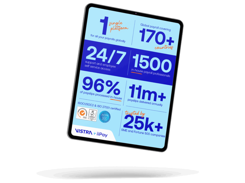
– Infographics
Essential services, complex to communicate
Payroll, tax and entity management are foundational to large organisations. Accuracy, compliance and consistency are expected as standard.
Vistra needed to connect with senior decision-makers responsible for procuring software and services in this space. People who understand risk and regulation, but who are also accountable for keeping teams supported and operations running without disruption.
The challenge was not to simplify complex services, but to make their value clearer. To move the conversation away from systems and process, and towards the people who rely on them to get it right.
Put the people first
Instead of opening with platforms or process, we put the focus on the professionals responsible for keeping these services running day to day. Compliance, payroll and entity management teams carry the responsibility for accuracy, continuity and confidence across borders, where missed fillings, payroll errors or governance gaps can have immediate and critical consequences.
That perspective shaped the tone of the work. Language was clear and respectful, written to reflect real pressures rather than product specifications, and to avoid the cliches common in category. The aim was to dramatise the services, but to show how they support teams in preventing risk and keeping organisations moving.
This people-first starting point provided a consistent foundation across Global Payroll, TSAS and EMS. Each service speaks to its own audience and challenges, while remaining part of a single, coherent Vistria story.
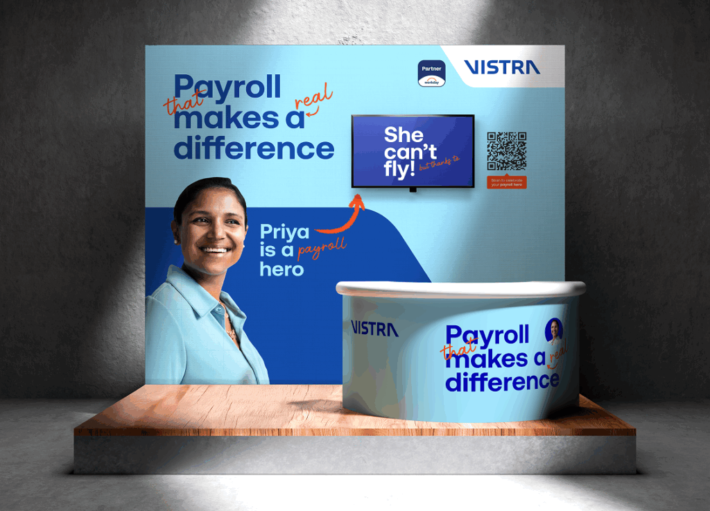
Campaign work built for real channels
We created a series of service-led campaigns designed to live where senior buyers actually spend time.
For each service, this included final campaign outputs developed for digital distribution, with LinkedIn as a primary channel. Creative avoided familiar enterprise clichés, favouring clear messaging, confidence and restraint over technical overload.
Across all three campaigns, messaging focused on outcomes rather than mechanics. Vistra’s platform remained present, but positioned as the foundation that enables organisations to operate smoothly across markets, rather than the headline itself.
A clearer, more confident presence
The campaigns gave Vistra a clearer, more confident way to talk about three services that are typically hard to promote. Across LinkedIn activity, click-through rates exceeded the typical B2B benchmark of 0.44%.
By shifting the focus away from systems and towards the work being supported, the creative helped reposition these services as credible, relevant and worth attention. Engagement came from the right audiences, reinforcing Vistra’s authority in a category where trust and operational confidence matter.
The approach also established a repeatable framework Vistra can build on across future service communications, creating consistency while allowing flexibility as the brand continues to evolve.
Related projects